Logo Development
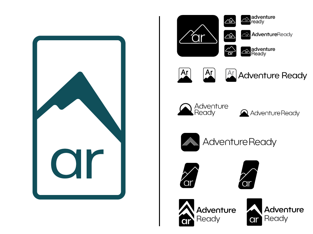
Process:
This brand aimed to launch a clean, premium-feeling line of outdoor hygiene products.
The parent, company, Adventure Ready Brands, uses a trail blaze as part of their logo and the final Adventure Ready Logo is a cleaned up trail marker.
Other ideations included a “play” triangle to more or less “press play on outdoor adventure,” while another set was based on periodic table elements. This was to emphasize that gear and preparation (particularly Adventure Ready products) was a key element in outdoor adventure.
Packaging Development
My initial approach was to leverage Kraft paper packaging to create a compelling, natural-feeling product with an allure of sustainability. After the initial look review, I moved toward more sleek and technological packaging. So, more iPhone and less BeesWrap.
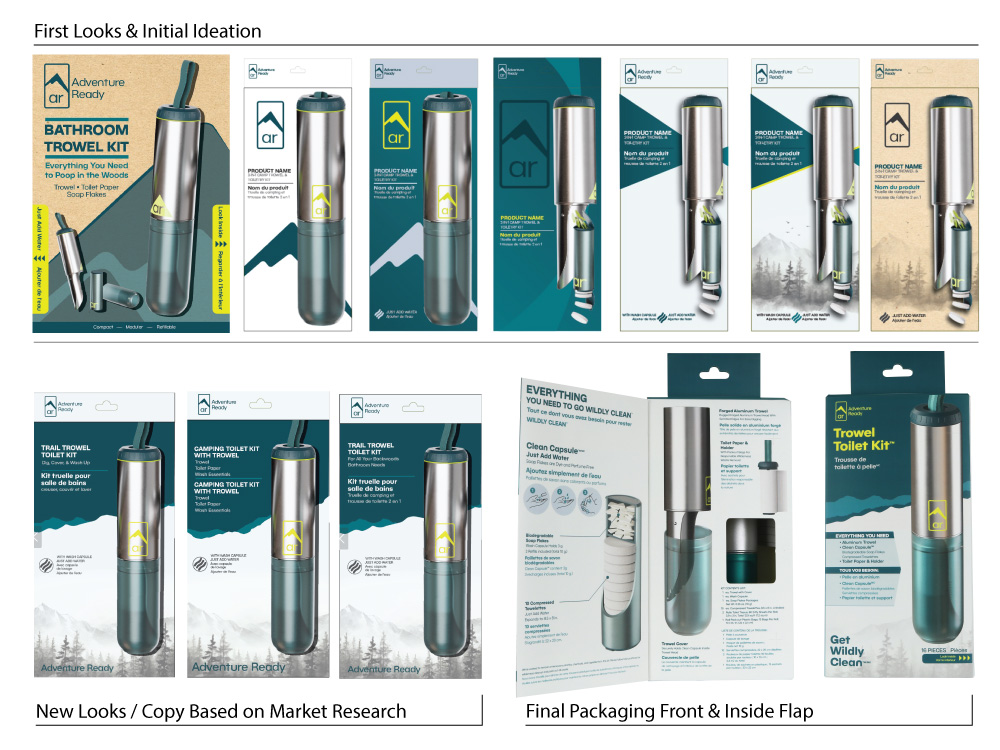
After honing in on the desired style, I added a soft illustration of mountains and trees. It’s more of a texture addition than a hard design element. I also did market research on front-of-pack inclusions and product names to ensure the kits were clear, eye-catching and felt worth the target MSRP. Research showed that people valued the product in the $60-70 range, but the MSRP was $40, which was a huge win for the client.
Final Packaging
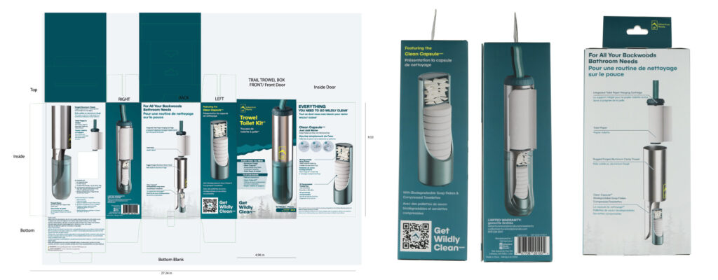
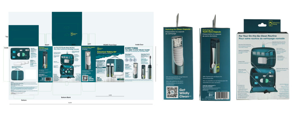
Accessory Packaging
With the primary packaging, logo, and other branding elements set, I also developed refill packaging for all the modules inside the kits. This consisted of several-size boxes and pouches, each with varying amounts of required regulatory language.

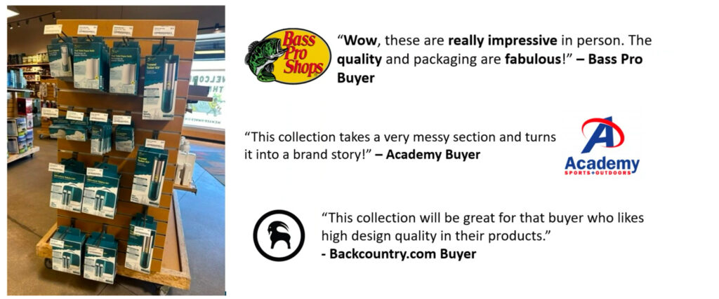
Product Feedback
